While there’s still much we don’t know about the “new world” being inaugurated by the COVID-19 pandemic, one thing we can be sure of is that it will be powered by data.
Indeed, in some ways, the coronavirus pandemic is the first truly global data event.
With millions forced to stay at home, large-scale data gathering by governments and institutions, and easy access to data visualization tools, the pandemic’s progress has unfolded, for most of us, in the form of numbers, charts, and visuals on screens. Take, for just one example, the meteoric rise of the website Worldometer1, which saw a 36,928%2 increase in traffic from April 2019 to May this year.
What is fascinating about this growing importance of data visualization is the variety and scope of techniques and approaches emerging.
Appeal of the humble statistical table
What makes Worldometer’s rise to such popularity so astonishing is the sheer simplicity of the website3. At first glance, its centrepiece web 1.0-style table tabulating country counts of cases, deaths, and conducted tests might seem outdated. Yet, the simple fact of numerical benchmarks and the ease of making comparisons across countries has had a distinct appeal. Indeed, even as doubts have been raised about the accuracy of its data4, the bare-facts style of presentation has garnered the website authority not just with individuals, but even governments.
Key role of journalistic dashboards
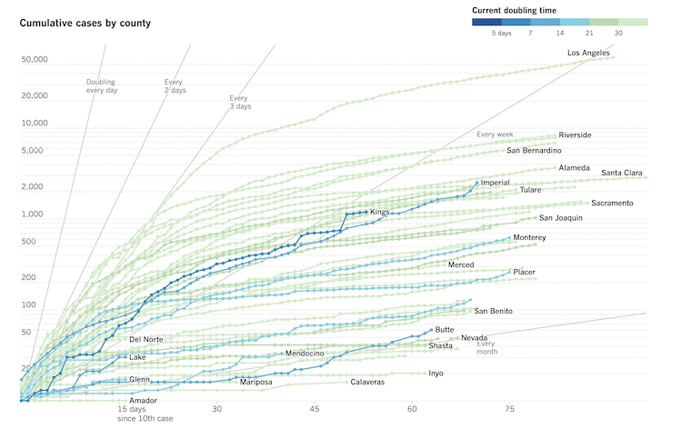
Of course, the reality of pandemic has come home to most individuals because of the dashboards put together by many media houses. With line charts, bar graphs, symbol maps, choropleth maps, and more, these dashboards weave together many disparate threads of the pandemic and its fallout to provide comprehensive, many-faceted narratives. Whether it’s the global picture presented by the likes of the BBC5 or the New York Times6, or the localized and granular lens of the L.A. Times7, journalistic dashboards have played a key role in conveying the urgency and magnitude of the pandemic to the wider public.

Journalistic dashboards aren’t exactly new, with numbers taking centre stage during major disasters, election seasons, and even for major sporting events. Yet, that data-driven journalism is here to stay is visible in such examples as the New York Times leading an article with a highly simple graph8 in place of a more customary human-interest photography. Incidentally, that graph in its many versions, which explains the idea of “flatten the curve,” could well be the most recognized image of the year, if not the decade. That a simple line chart could receive such global recognition is a testament to the power of data visualization in the present.
We need to flatten the curve of new versions of the flatten the curve chart pic.twitter.com/62u2IVq3te
— Andy Kirk (@visualisingdata) March 24, 2020
The power of animation
Nearly as significant as the “flatten the curve” line chart was an animated simulation9 by the Washington Post of how a hypothetical disease called “simulitis” might spread through a population under normal conditions and physical distancing. Coming as it did early in the spread of the pandemic to the US, this simulation provided an unambiguous message about the dangers of ignoring calls for physical distancing. Not surprisingly, this highly simplified animation using colored dots was one of Washington Post’s most shared pieces of content on COVID-19.
The interactive “game” called “People of the Pandemic”10 took this idea many steps further, simulating the effects of everyday decisions such as visiting a friend’s home or going out to a café on the chances of contracting the infection and receiving adequate medical care in different communities in the US.
On another track, the New York Times created a 3-D simulation11 of the spread of respiratory droplets from breathing, coughing or sneezing to show the vital importance of physical distancing. Such creative data visualizations have played an inestimable role in ensuring that the until-recently alien concept of physical distancing was understood across the board.
The power of a single metric
While most news outlets have built multiple, layered narratives around key pieces of visualization, Instagram co-founders Kevin Systrom and Mike Krieger have bet on the value of a single key metric with Rt.live12. For the millennial generation that finds itself home in such ecosystems as Tik-Tok and Instagram, pushing for bite-sized, no-frills, outcome-focused information, Rt.live holds a significant promise—the understanding of a pandemic through one metric. In simple terms, “Rt” tracks the speed of spread of COVID-19 by measuring the average number of people who become infected from an infected person.
Building partnerships with subject matter experts
Even as the growing importance of data visualization has been widely acknowledged, some alarm bells have sounded over possible abuse of data visualization. While some of the cautionary advice has focused on the fundamentals of data science and visualization best practices, others have also highlighted the importance of acknowledging subject matter experts. While this point is often made with regard to the expertise of epidemiologists when it comes to the COVID-19 pandemic, the value of good old fashioned reporting for providing vital context to data and visualizations should also be acknowledged13.
In the next post, we’ll look at how data visualisation is being integrated into a variety of domains, and the professional roles that make this possible.
- https://www.worldometers.info/ [return]
- https://www.axios.com/worldometer-coronavirus-78664b26-5cfd-4887-a8e6-2eda0db7daa7.html [return]
- https://www.worldometers.info/coronavirus/ [return]
- https://edition.cnn.com/interactive/2020/05/world/worldometer-coronavirus-mystery/ [return]
- https://www.bbc.com/news/world-51235105 [return]
- https://www.nytimes.com/interactive/2020/world/coronavirus-maps.html [return]
- https://www.latimes.com/projects/california-coronavirus-cases-tracking-outbreak/ [return]
- https://www.nytimes.com/article/flatten-curve-coronavirus.html [return]
- https://www.washingtonpost.com/graphics/2020/world/corona-simulator/ [return]
- https://peopleofthepandemicgame.com/ [return]
- https://www.nytimes.com/interactive/2020/04/14/science/coronavirus-transmission-cough-6-feet-ar-ul.html [return]
- https://rt.live/ [return]
- https://learn.stanford.edu/data-driven-storytelling-wbn-on-demand.html [return]

